
Styling With Intention: Timeworn Vintage Decor Styled With Purpose
This page contains affiliate links which means we may receive a commission for purchases made through links. Learn more in our Privacy Policy.
This was easily one of my favorite hutch looks to date!
I’ve been wanting to restyle this antique hutch for some time, and with the addition of a few new arrivals in the shop, I finally had the pieces I needed to bring a look together.
I really wanted to challenge myself to think a bit outside the box on this one and do something a little unexpected.
That said, I still tend to follow a few foundational guidelines when styling any bookshelf, which I share more about in this blog post:
» How to Style Shelves Like A Pro: 5 Easy Tips for a Timeless, Layered Look «
For this look, I applied the basic principles I cover in the post above, because I do believe they are fundamental to creating a cohesive and layered bookshelf. At the same time, I also tried a few things I do not normally do with my bookshelf styling that I think bring something unexpected and special to the space.
So in this post, I’m sharing the pieces that helped bring this look together, how I chose to style them, and why I believe it works.
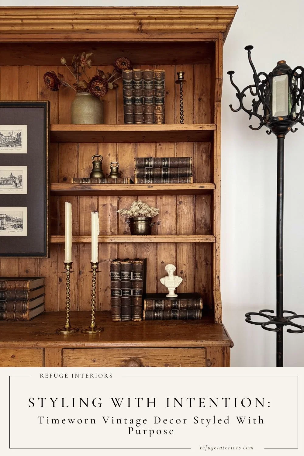
About the Look.
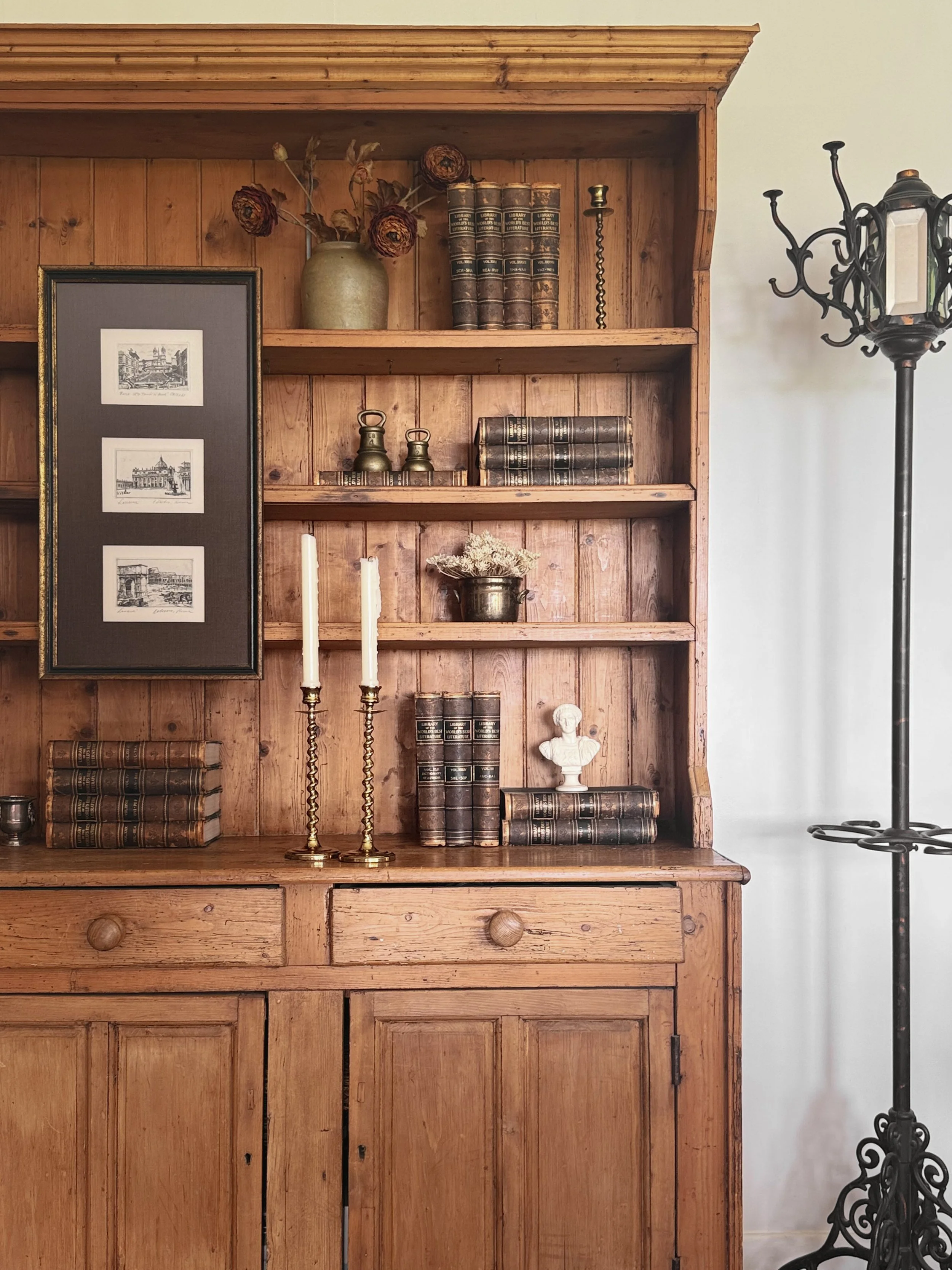
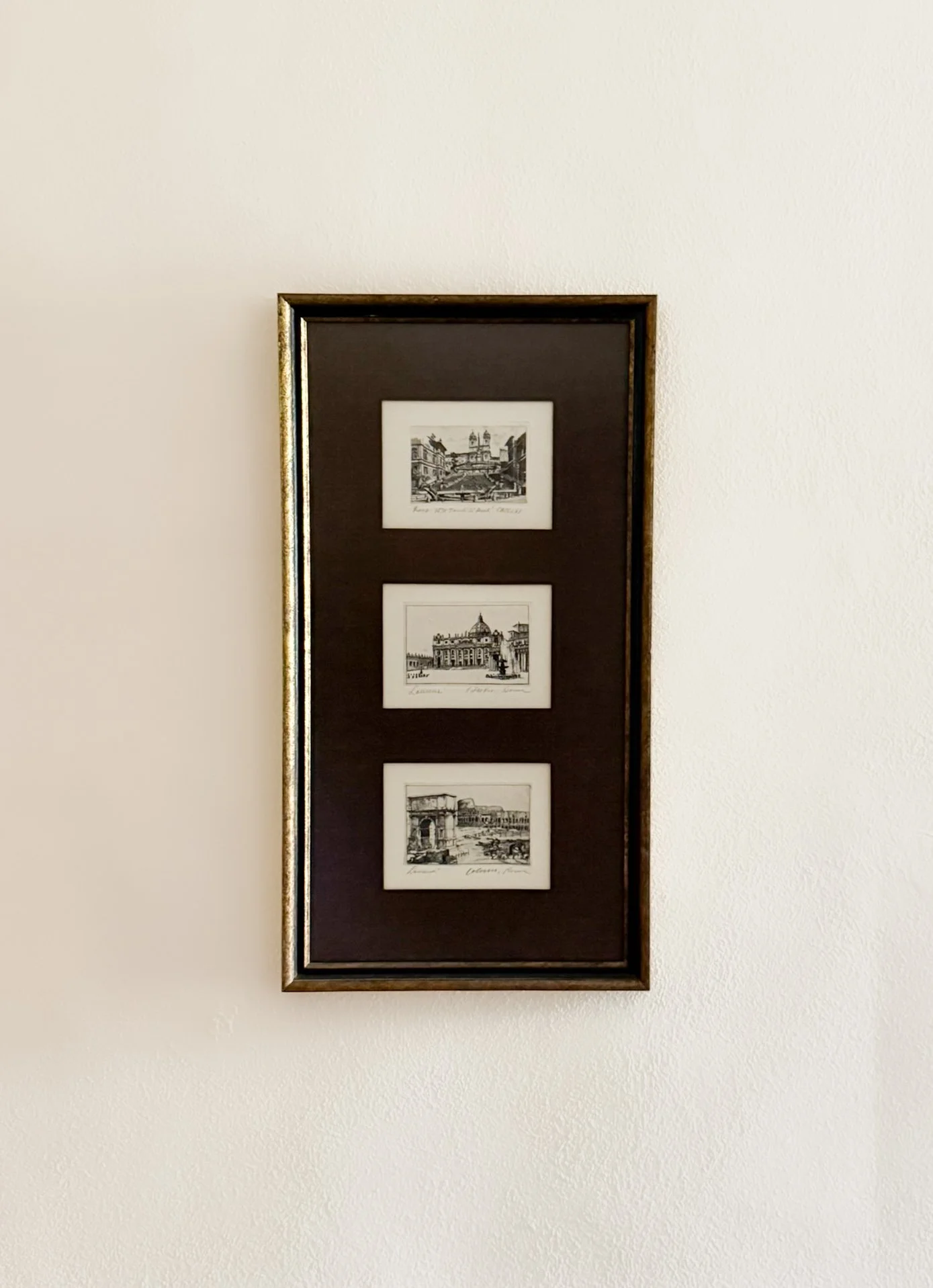
The look really began with a determination to use this set of beautiful Framed European Architectural Etchings. This is a recent piece we were able to acquire for the shop, and I was in love with it the moment I saw it.
The artwork itself is, of course, stunning, featuring signed etchings of three iconic landmarks in Rome, Italy, including Trinità dei Monti, St. Peter’s Basilica, and the Colosseum. The detailing is intricate, and each scene is so full of character.
Additionally, and perhaps what I appreciate most, is the way in which these pieces were thoughtfully framed.
The matting is a rich dark brown, and the frame features subtle brushed gold detailing that adds incredible warmth. Altogether, it is truly a beautiful piece.
The challenge, however, is that this is not a typical piece you would use on a bookshelf, mainly because of its tall, elongated form, measuring 25 inches in height.
Right away, I knew I wanted to try hanging this piece on the face of the hutch. Typically, when I have seen art styled this way, it is on a larger library-style bookcase, with multiple connecting units that stretch up to the ceiling, but I cannot say I have personally seen it done before on a simple antique hutch. So I thought why not give it a shot!
As soon as I hung it, I loved the scale in relation to the hutch itself. It stretches perfectly across the three shelves without feeling overpowering, just beautifully balanced. That is one of the main reasons I think it works so well styled this way. Anything smaller would have felt underwhelming, while anything larger would have overwhelmed the hutch.
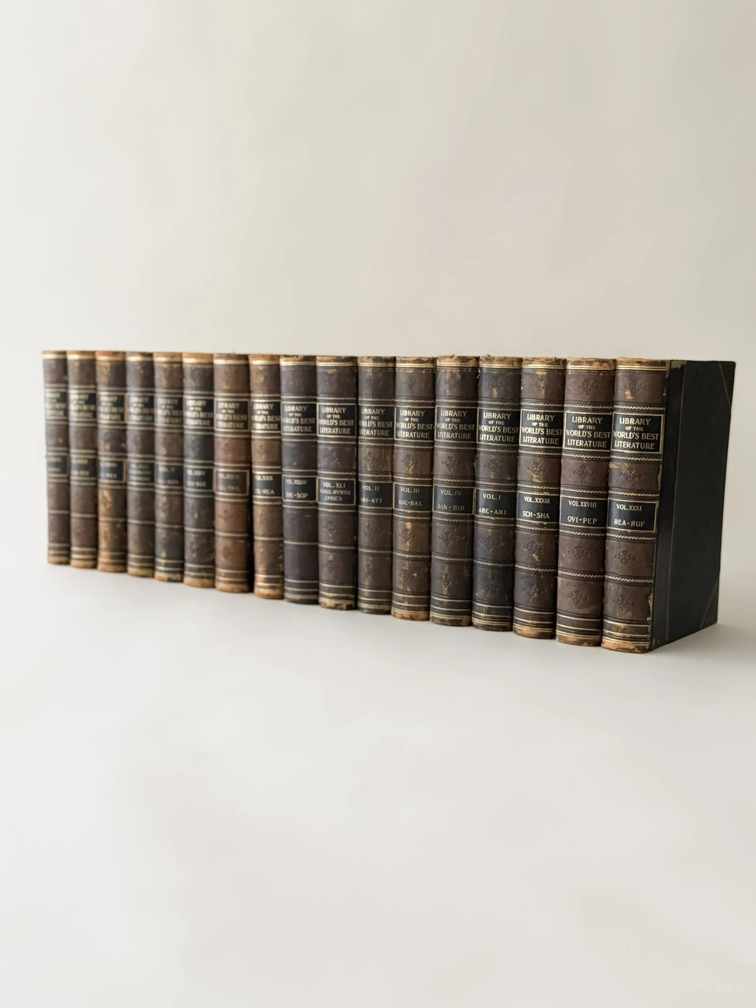
With the etchings firmly in place, I needed to find a way to balance the visual weight of the artwork on the opposite side of the hutch, so I reached for our Library of the World's Best Literature collection. I used all 17 volumes we currently have in the collection, and right away what stood out most was how beautifully the gilt detailing on the bindings and the rich brown spines of the books echoed the gold tones in the frame of the artwork. This was simply a match made in heaven.
With the tones coming together even better than I had imagined, I shifted my focus to how I could use the books to fill the remaining space in a way that felt balanced and intentional. I played with a mix of vertical and horizontal book placement to help fill out the shelves while still allowing for breathing room. That balance of structure and negative space is absolutely key (I share more about this in the blog post mentioned above).
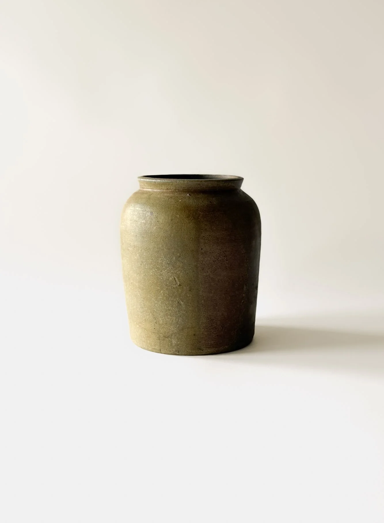
With the books in place, I then added my florals and vases. I chose a Small Stoneware Crock, which is the perfect height for the top shelf of the hutch and paired it with what are probably my favorite florals of all time (linked below). They are technically fall florals, but I am always drawn to their warm, moody tones, and I find myself reaching for them again and again.
For additional movement, I brought in a small brass footed vessel from my personal collection. Pieces like this are not particularly rare, but they are something I always try to snag when I am sourcing because they are so useful for styling when you need something to fill a smaller space. I paired this piece with a soft yellow floral that I have had for years. While this exact stem is no longer available, it is very similar to many dried florals you see on the market and a great example of how softer tones can complement a space without standing out. These florals work quietly in the background, adding a touch of softness and movement in a way that feels natural and cohesive but they don’t compete with the other florals or pull your attention from the more prominent pieces in this look.
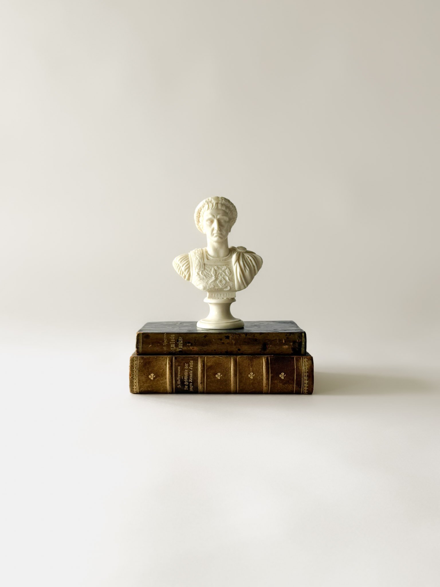
Finally, it was time to bring in the sculptural elements, which is always my favorite part of styling any space. For this look, I used this Mini Roman Emperor Sculpture, which beautifully ties back to the Roman etchings above. The scale is just right for the hutch, and the lighter tone adds a subtle contrast against the darker elements throughout and the warm tones of the hutch.
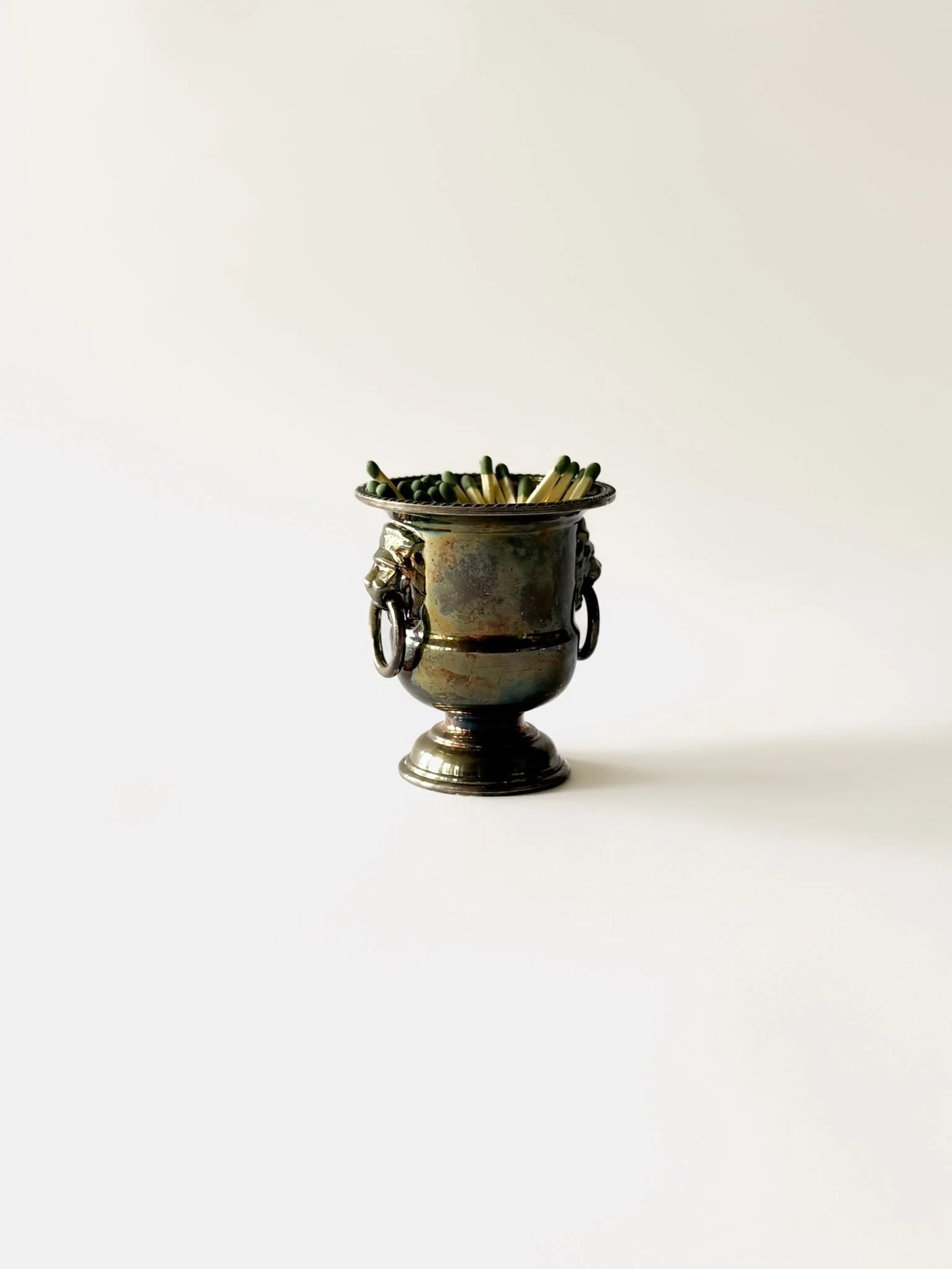
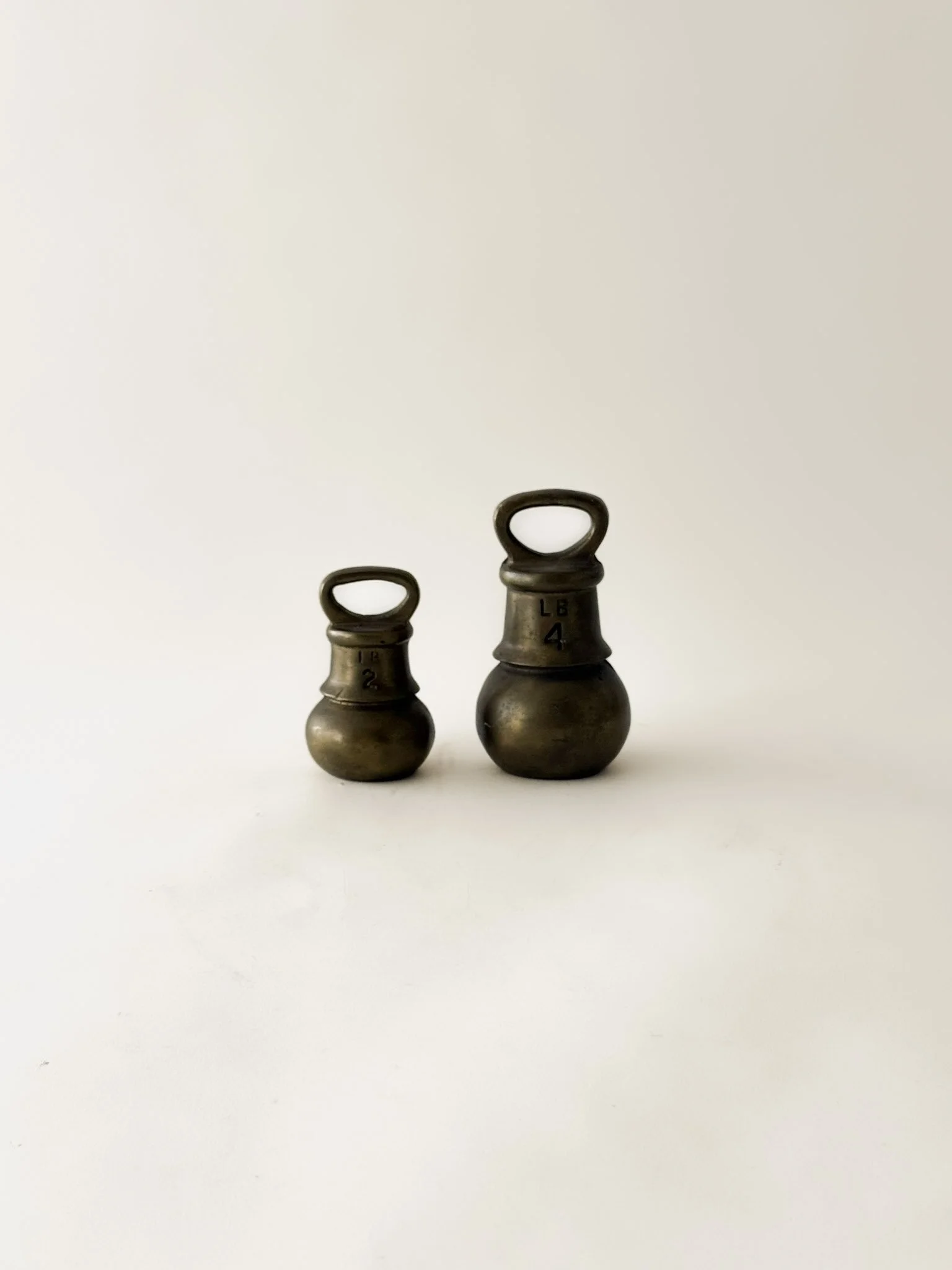
I then added our Set of English Scale Weights. I love the silhouette of these pieces and the staggered arrangement because it adds beautiful variation to this look overall. I also incorporated a Mini Silverplated Champagne Bucket Match Holder. The use of warmer silver tones help break up all the brass, adding another layer of interest, without disrupting the overall warmth of the palette.
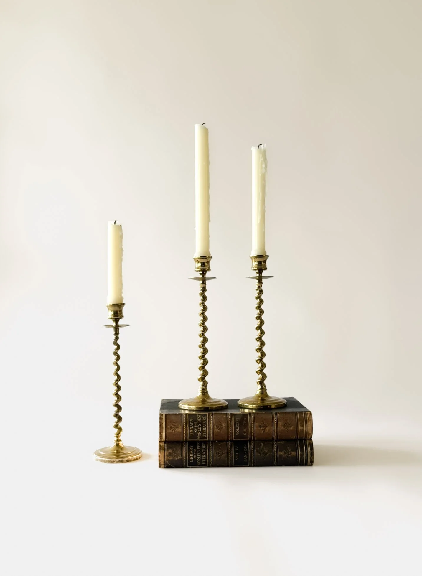
To finish the look, I reached for a set of three Solid Brass Barley Twist Candleholders. One of the more unexpected choices here was using two of these taller candleholders with taller taper candles for a look that extends beyond the height of the shelf. Typically, when styling a bookshelf, everything stays contained within the shelf lines, but I loved how these interact with the artwork hanging on the face of the hutch for something just a little unexpected. It helps connect the entire composition vertically and adds yet another interesting and unexpected element.
Another surprising decision with regard to the candleholders is that I chose to leave the third one without candles, allowing it to read more as sculptural elements rather than purely functional pieces. This isn’t something I typically do when I am styling shelves, but I just think it works beautifully in this vignette.
Ultimately, I think what really makes this look work is the intention behind each choice. From balancing visual weight and repeating tones to mixing heights, materials, and allowing for just the right amount of negative space, every element plays a role. It is that thoughtful layering and sense of purpose, paired with a couple of unexpected touches, that transforms this collection of objects into a space that feels warm, collected, and complete.
Shop the Look.
Antique & Vintage Pieces from Refuge Interiors:
Additional Decor Featured in This Look:
Hi, I’m Casey, founder of Refuge Interiors, where I combine my lifelong love of decorating and design with a passion for sourcing vintage and antique treasures to create classic, collected interiors that feel warm, inviting, and beautifully lived in.
Follow along and discover more moments, more vintage, and more inspiration!